To get an insight into how to construct my book it’s essential to look into book designs from existing photographers and how they display their own work. This will allow me to creatively think of how to suitably design my book for my readers. Peter Galassi’s book Jeff Wall’s (2007), is one that I will be getting inspiration from. The majority of the layout in this book focuses on single images presented to the right of the page. This allows the viewer to read the images individually so that images do not correspond to each other. I will be listing the books page numbers from the book to analyse some of Jeff Wall’s photographs.
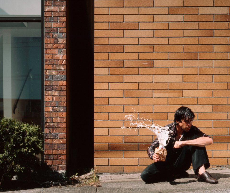
The layout from the left consists of a blank white page, however the title and year of the photo is shown at the bottom of the page. For example in the picture “Milk 1984”.(pg 82) on the right is a photo of a man on the ground holding a carton of milk which has exploded. Analysing this image I sense the man on the ground feels alone and anxious through his body language. Reading this he seems to be very tense and has a lot of concerns and stress inside and the milk represents his inner-mind exploding due to his negative thoughts. The tense veins in his arm also indicates that he is agitated and angry because he may have lost his job or having issues at home.

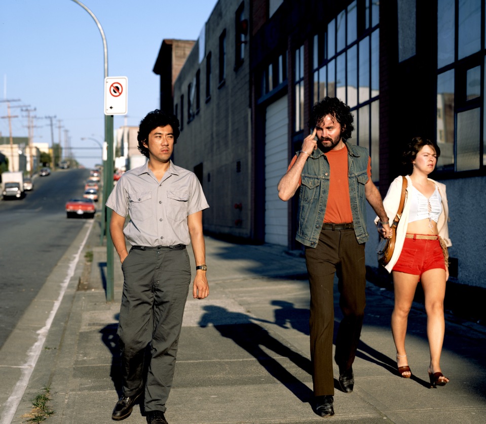
Another photograph by Jeff Wall who was influenced by gestures in the streets that we do not pick up on easily. This image is called “mimic 1982” (pg 78) which focuses on small gestures that are unnoticeable. By reading this I can see a male and female holding hands who are a couple and on the left a middle aged Asian man. Analysing the photograph, the Asian man is walking pass in front of them, glaring over to the right. This is portraying that the Asian man could be jealous of the other man’s wife. The other male is putting his middle finger up beside his head, this can symbolises a form of hate towards him. This can also be read as a form of hate towards Asian people.

The layout of the book intrigues me as most of the images are in different sizes, ranging from wide angle images, portraits to landscapes. In my opinion I feel that the images are presented quite well with the single images to the right of the page. However, for my documented series, I might focus on keeping the size and ratio of my images the same. In my opinion it would be interesting to follow a similar layout, however include two images and some text on either side for my readers to follow. I want to add two images together so they correspond to each other for my journey.
References:
Galassi P. (2007), Jeff Wall, New York, The Museum of Modern Art.
http://www.tate.org.uk/whats-on/tate-modern/exhibition/jeff-wall/room-guide/jeff-wall-room-3
